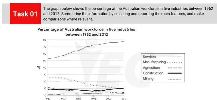
The line chart details the percentage of workers in Australia according to 5 different industries from 1962 to 2012. Looking from an overall perspective, it is readily apparent that the most noticeable growth and the vast majority of jobs was concentrated in the services industry. There was decline in the workforce for jobs in agriculture and manufacturing, and slight rises for the remaining two industries.
In 1962, approximately 52% of Australians worked in services, a figure far above the next closest sector, manufacturing (27%). From that point onwards, service jobs grew rapidly to reach 72% by 1992 and then growth tapered off and rose more moderately to finish the period at just under 80%. In contrast, manufacturing as an employment option was stable over the first decade before a consistent decline led to a final figure of 10% in 2012.
In terms of the less common jobs, agricultural workers declined at steady intervals from just above 10% in 1962 to a low of 4% in 2012. In comparison, mining and construction jobs were generally stable with minor growth, rising from 9% and 1% to 10% and 2%, respectively.
Analysis
1. The line chart details the percentage of workers in Australia according to 5 different industries from 1962 to 2012. 2. Looking from an overall perspective, it is readily apparent that the most noticeable growth and the vast majority of jobs was concentrated in the services industry. 3. There was decline in the workforce for jobs in agriculture and manufacturing, and slight rises for the remaining two industries.
- Paraphrase what the bar chart shows.
- Write a clear overview summarising the differences and the overall trend.
- This one is a little complex so it needs a second sentence for the overview.
1. In 1962, approximately 52% of Australians worked in services, a figure far above the next closest sector, manufacturing (27%). 2. From that point onwards, service jobs grew rapidly to reach 72% by 1992 and then growth tapered off and rose more moderately to finish the period at just under 80%. 3. In contrast, manufacturing as an employment option was stable over the first decade before a consistent decline led to a final figure of 10% in 2012.
- Begin writing about the data for the first categories.
- Compare between each sentence.
- Add in all the data.
1. In terms of the less common jobs, agricultural workers declined at steady intervals from just above 10% in 1962 to a low of 4% in 2012. 2. In comparison, mining and construction jobs were generally stable with minor growth, rising from 9% and 1% to 10% and 2%, respectively.
- Write about the final other parts of the graph – include everything!
- Include all the data.